The most overlooked and neglected aspect of excellent web design is online forms. Overshadowed by flashy homepages and visuals, the practical functionality of forms are often glanced at but not given fitting attention, leading to forms with less than optimal user experience. If your forms have low conversion rates, you are missing out on a lot of opportunities: sales, registrations, survey results, subscriptions, and other form submissions. Implement the best practices for forms, and watch your conversion rate increase.
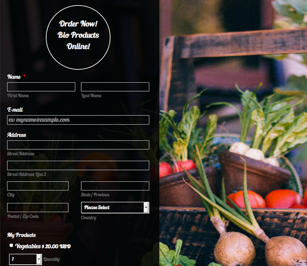
First, make your form easy to fill out. This may seem obvious, but there are several nuances that could be pulling down your conversion rate. Ensure visitors know what is needed so they don’t have to resubmit by using specific labels. For example, the form should specify “first name” and “last name” if both are necessary. If a form field is unclear, show the visitor the format needed, such as separated segments or pre-made dashes for a phone number. Group form fields together intuitively, and separate them with a border, whitespace, or other indicator to make the form more visually concise.
Use directional cues to guide the visitor through your form. Utilize visual symbols like arrows, bullet points, and separators to steer your visitor in the right direction. Make proper use of white space. A text-heavy section can seem daunting and can cause your visitor to give up on the form, so utilize white space to break up the text. This can make the same amount of form fields seem more digestible, leading to a higher conversion rate.
Similarly, make use of color contrast techniques to help make your form fields pop. Black against white and vice versa is always a bold and safe choice. Complementary colors, when placed next to each other, create the strongest contrast for those particular two colors. For example: red and green, blue and orange, purple and yellow. Make the form’s call to action button stand out, and consider changing the default label “submit” to something more descriptive, such as “Subscribe to Newsletter,” “Start My Free Trial,” “Add Comment,” or whatever the action item is.
Keep the amount of information on the page to a minimum, scrap the unnecessary form fields. You can indicate that certain form fields are optional, although one of the only times that is helpful to add is for extra address information (such as apartment number, etc.). Your button should make it apparent that it is clickable. You can add a rollover feature or shadow, 3D enhancement, highlight, or another effect to make it evident. When a visitor hovers over the button it can change color or look like it is pressed.
Communicate with the user as they fill out the form, predicting and mitigating any confusion that may arise. Messages give the user feedback based on their input, and can appear as a pop-up or highlighted text. Messages can come in the form of feedback (“thank you for submitting this form!”), or as an instruction (“the username that you have selected is already taken, please choose another”). Group related information together in a way that makes sense, and so the flow of the form fields resemble a conversation or interaction instead of a seemingly never-ending list of questions.
For long forms, especially those that click through to more than one page, illuminate a clear path to completion. Progress bars that show the number of steps in the process, or that show the percentage of the form that is completed, encourage visitors to finish the form. If a form is especially time-consuming, like some job application forms, offering the ability to save and return to the form is an appreciated feature.
Test and analyze your forms to continuously improve your results. Even small modifications like changing the call to action or decluttering the area around the form can yield a big impact. Put into action the best practices for forms while continuing to test and tweak your form design to continually strive for a stronger conversion rate.
About the Author: Leeyen Rogers is VP of Marketing at JotForm, a popular online form building tool. She is a Bostonian living in San Francisco, and is an alumna of the University of Miami.
Edited by Dominick Sorrentino